This morning myself and Bec gave in our catalogues and were so happy with the comments we received from Topman Trafford! The managers were so pleased with the work we had produced! From the Tshirt designs, to the time taken to produce the final booklet!
They said they didn't know what they were expecting... but it wasn't a standard as good as this! :)
Me and Bec have worked so hard on this and to hear these positive comments was really encouraging! Sometimes we do doubt ourselves but this has made us realise that we need to go with it and be more confident! We are so proud of ourselves and will be using the weekend to celebrate. Even if they don't get printed, this has been a huge learning curve for us, it has also given us an opportunity to work together. So this is still a reason to celebrate... Getting printed will be a bonus!!
Thanks for the support TSTMTRAFFORD! We already have a few members of staff wanting to buy the Tshirts so fingers crossed!
... Now we need to please the 'big dogs' in London...

Two Manchester born girls, two graphic design degrees and a whole lot of adventure! We established Rodo Creative in 2010, our skills range from wedding invitations to thank you cards (and everything in between). We promise to create, manufacture and deliver all the essentials for your perfect wedding. Invite us to be part of your special day.
Thursday, 11 August 2011

Finished Catalogues!!


After a long few weeks of designing and decision making our Tshirts are finished!! And we're so pleased with the result!!
We decided the best way to show off our designs would be to use a catalogue format. Our catalogue features all forty designs as well as our inspirations and original photography- contact information can be found on the back page.
We felt that the way we bound our book was important for the presentation of our ideas. Originally we were going to staple our book together our use a ring binder, but thinking more into it we believed that sewing would be more appropriate, bringing tools used in fashion and producing a more exclusive and handmade look! We used the pamphlet stitch with black cotton - a simple but nice touch.
It would have been easier to go to the printer.... But we wanted to do it ourselves and feel the full sense of achievement!
Hand in time TOMORROW! Hope the guys like what we have produced.. We will keep you updated!
Tuesday, 2 August 2011
Jade Corker Photography


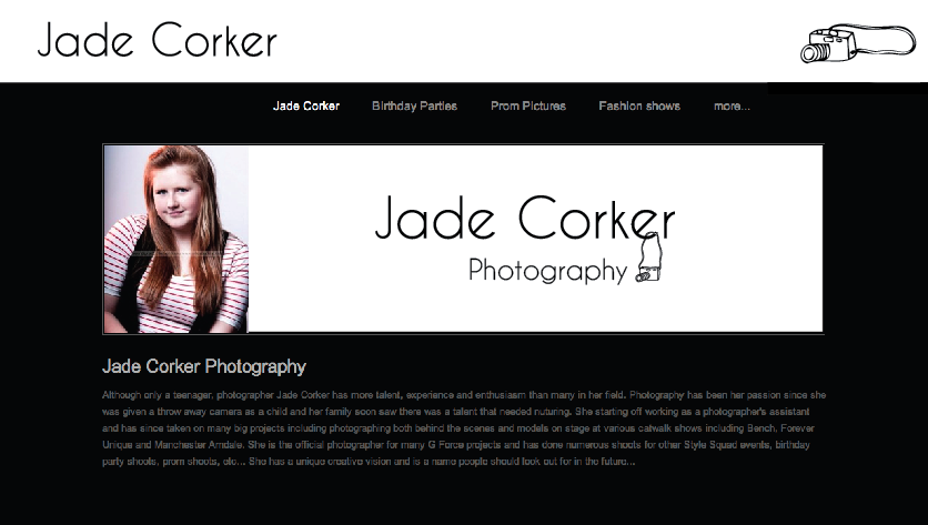

Some more design ideas for Jade Corkers Photography.
I wanted to type to be friendly and fun because Jade is a young upcoming photographer. The logo had to be eye catching for her young clients at the moment and for the future. I have worked with illustrations of cameras and focus symbols to play alongside to type.
I think we have come up with a very good range of ideas that are not similar, but now she has the hard task of picking!
We will let you know when her decision has been made!
Rodo out
Jade Corker Photography
Last week a friend of mine got in touch asking me to design a logo for his sister who has just recently got her own photography studio! I was excited to start designing and got Becky Doherty involved as well! It would be another job for Rodo! We used Skype to its advantage and took the time to discuss ideas before we began designing.
Rather than working together on this, we thought it would be best to create our ideas separately and then see what we came up with!
Our Plan:
We thought it was essential for the name 'Jade Corker Photography' to stand out, the design had to be clean, simple and memorable- pictures or illustrations may confuse the reader! Being Jades first studio we wanted to give her a professional look - Her previous website was very simple and I struggled to see her identity coming through. We wanted to create a logo which would be easily adapted to websites and business cards - we also wanted to reflect Jade as a person!
 |
| Previous Website Design |
Below is the PDF I have sent through to Jade pitching a couple of the ideas for her new website and logo! I am yet to hear from Jade as she is busy getting the studio up to standard.


In the logo I have used three different camera lenses to add some character. Although I wanted it purely typographic to begin with, after playing around with different routs I decided that simple detail would go a long way and add some interest. I like that fact that the lenses aren't obvious- you only notice them once told.
Our colour choice came from her name - 'Jade' Green. We love the colour, it is fresh and represents her young age well, it is also neutral and easily adaptable! We are pleased with the new identitys we have given Jade and hopefully she is too! She has been a pleasure to work for and if she needs any work doing in the future we would gladly work with her again!
Thursday, 28 July 2011
Rodo at work!


Busy day in the studio today!
40 Tshirts done and layout for brochure confirmed!
Spoken to Topman the date of submission is now Friday 5th August! Good news! Giving us more time to finalize ideas and develop further themes :)!
Will be a busy weekend but next week all of this hard work will pay off when we see the final outcomes!
Comments needed to help us choose the best Ts which will be printed on a larger scale!
Rodo out!
Wednesday, 27 July 2011
Topman day 1 and 2 from the other half


Had a very productive day today on the Topman design tee's!

So far we have some very clear ideas that we are definately going to take forward and finalise together. With our theme being based on 'travel', yesterday I looked through all my holiday photos and picked out some interesting ones that will look good on tee's. They are based on Berlin and Egypt.
With Sarah coming up with some good designs using photographs and collages, I have moved away from travel to a more abstract look.
I have been looking at hand drawings/doodles and seeing how they look on different coloured tee's. I am really pleased with the outcomes, more than my photography tee's, and I have had lots of fun doodling!
Myself and Sarah have had a meeting today about the new direction. She liked what was going on on the share screen (thanks skype) and hopefully likes the new ones too! We talked about drawing and how my style is quite quirky and hers is more realistic, so together would be a very interesting mix, which we will see coming together soon! Watch this space! :)
Subscribe to:
Posts (Atom)