Showing posts with label Logos. Show all posts

Monday, 21 January 2013

ITV Logo

Although we seem to be in the minority... We love the new ITV logo!


Some have said it reminds them of a child's crayon drawing or a bottom! But we think that the playful look in comparison to the corporate style is a vast improvement.

An element of the design which sets it apart from the rest is the colour changing idea. It adapts to the surrounding screen and mimics the colour of the program it is advertising. A clever idea which enables the logo to match the mood of the program without losing the branding.


Take a read of this article on the daily mail... We are hoping that people will warm to the redesign and also look forward to seeing what they do with ITV 2 ect!

What the daily mail say

- Posted using BlogPress from my iPhone

Sunday, 23 September 2012

Preparing for Sales! Fabric Labels


FABRIC LABELS:


We had some trouble with our fabric labels, our t-shirts were ready to be sold and our paper tags were ready to be attached, however the company we used to print our Fabric Labels let us down on a number of occasions! It put our launch date back and caused a lot of frustration - we were ready but our t-shirts weren't.

We received our labels from http://www.wovenlabelsuk.com late and although not very pleased with the service, we are very happy with our labels - Better late than never I suppose!


Tuesday, 2 August 2011

Jade Corker Photography


Some more design ideas for Jade Corkers Photography.

I wanted to type to be friendly and fun because Jade is a young upcoming photographer. The logo had to be eye catching for her young clients at the moment and for the future. I have worked with illustrations of cameras and focus symbols to play alongside to type.

I think we have come up with a very good range of ideas that are not similar, but now she has the hard task of picking!

We will let you know when her decision has been made!

Rodo out


Jade Corker Photography


Last week a friend of mine got in touch asking me to design a logo for his sister who has just recently got her own photography studio! I was excited to start designing and got Becky Doherty involved as well! It would be another job for Rodo! We used Skype to its advantage and took the time to discuss ideas before we began designing.

Rather than working together on this, we thought it would be best to create our ideas separately and then see what we came up with!

Our Plan:

We thought it was essential for the name 'Jade Corker Photography' to stand out, the design had to be clean, simple and memorable- pictures or illustrations may confuse the reader! Being Jades first studio we wanted to give her a professional look - Her previous website was very simple and I struggled to see her identity coming through. We wanted to create a logo which would be easily adapted to websites and business cards - we also wanted to reflect Jade as a person!

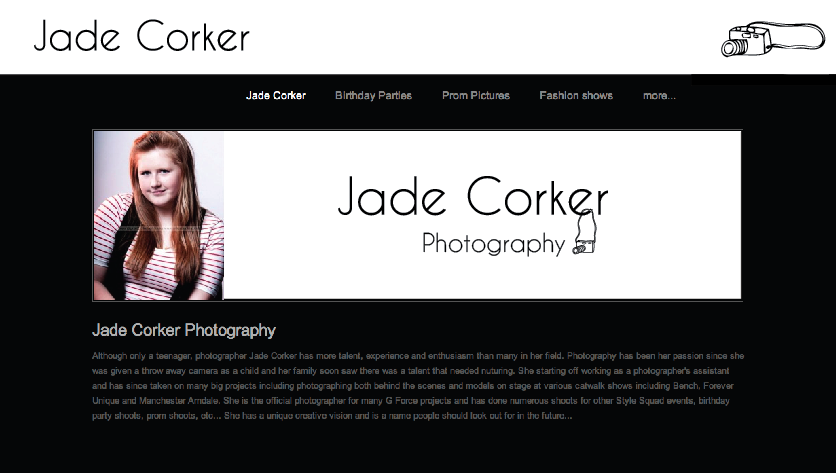
Previous Website Design

Below is the PDF I have sent through to Jade pitching a couple of the ideas for her new website and logo! I am yet to hear from Jade as she is busy getting the studio up to standard.


In the logo I have used three different camera lenses to add some character. Although I wanted it purely typographic to begin with, after playing around with different routs I decided that simple detail would go a long way and add some interest. I like that fact that the lenses aren't obvious- you only notice them once told.

Our colour choice came from her name - 'Jade' Green. We love the colour, it is fresh and represents her young age well, it is also neutral and easily adaptable! We are pleased with the new identitys we have given Jade and hopefully she is too! She has been a pleasure to work for and if she needs any work doing in the future we would gladly work with her again!